an archive of my designs for PAST seasons of origins from newest to oldest.
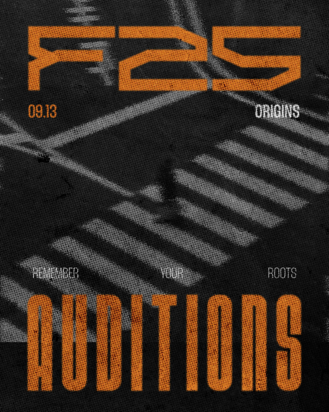
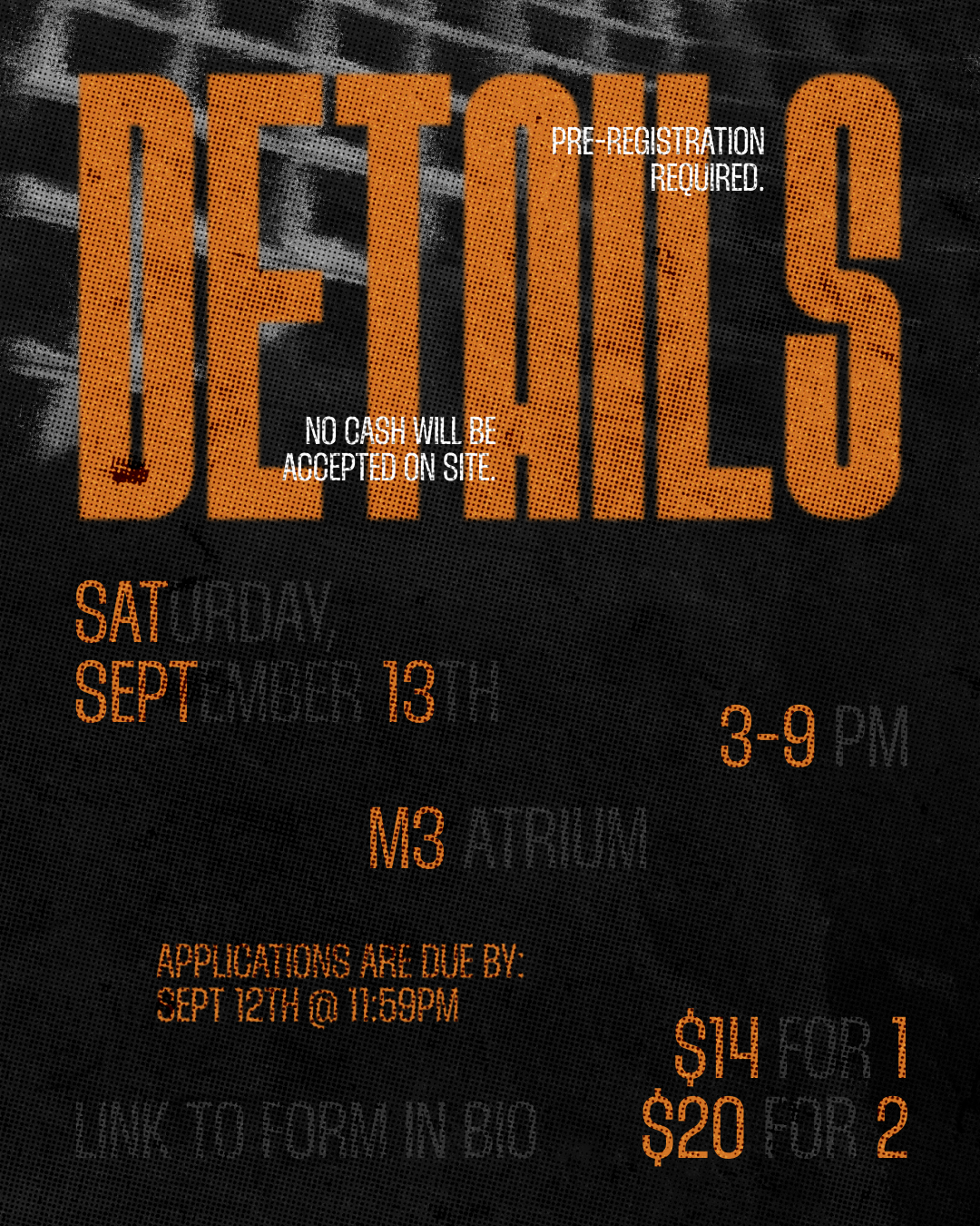
Fall 2025




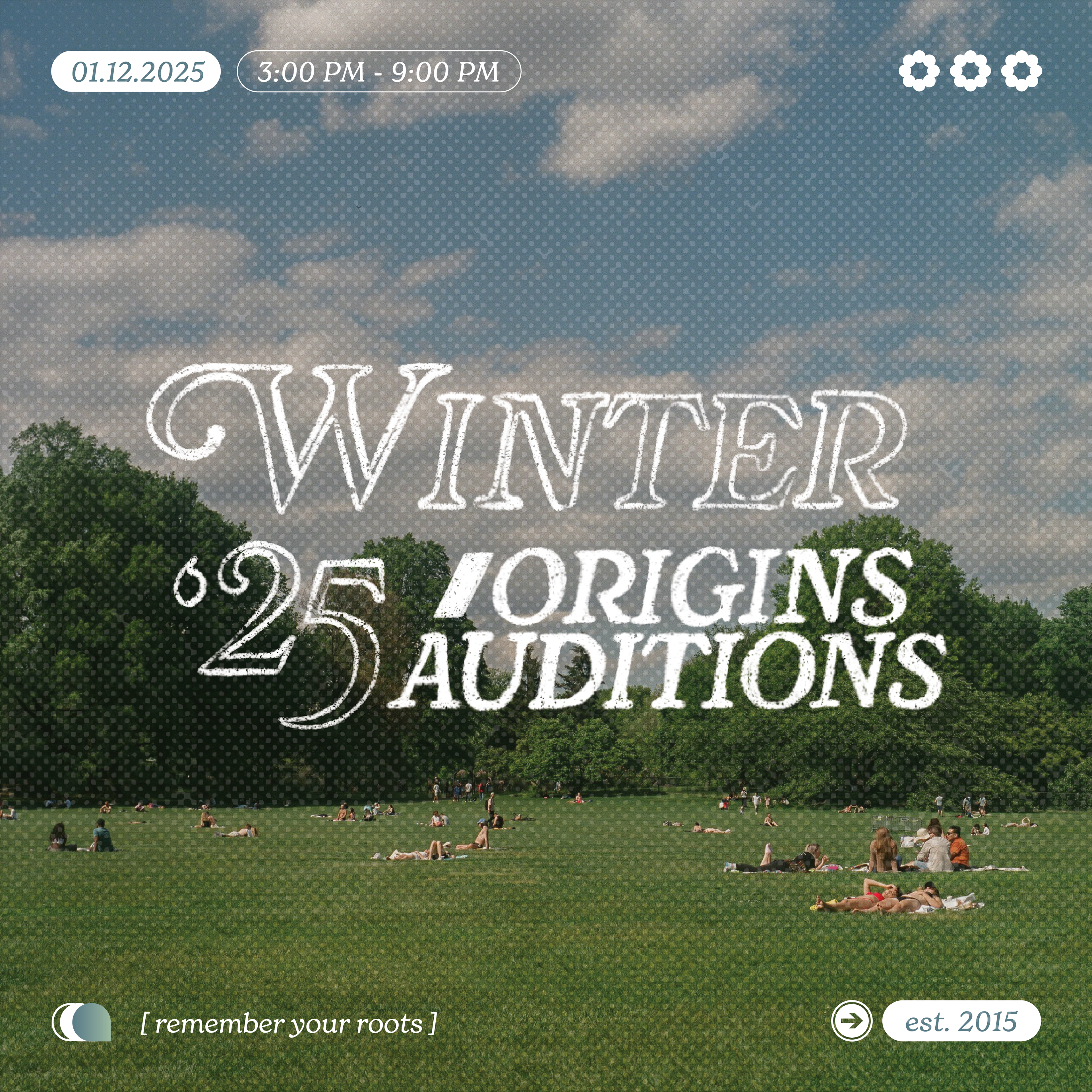
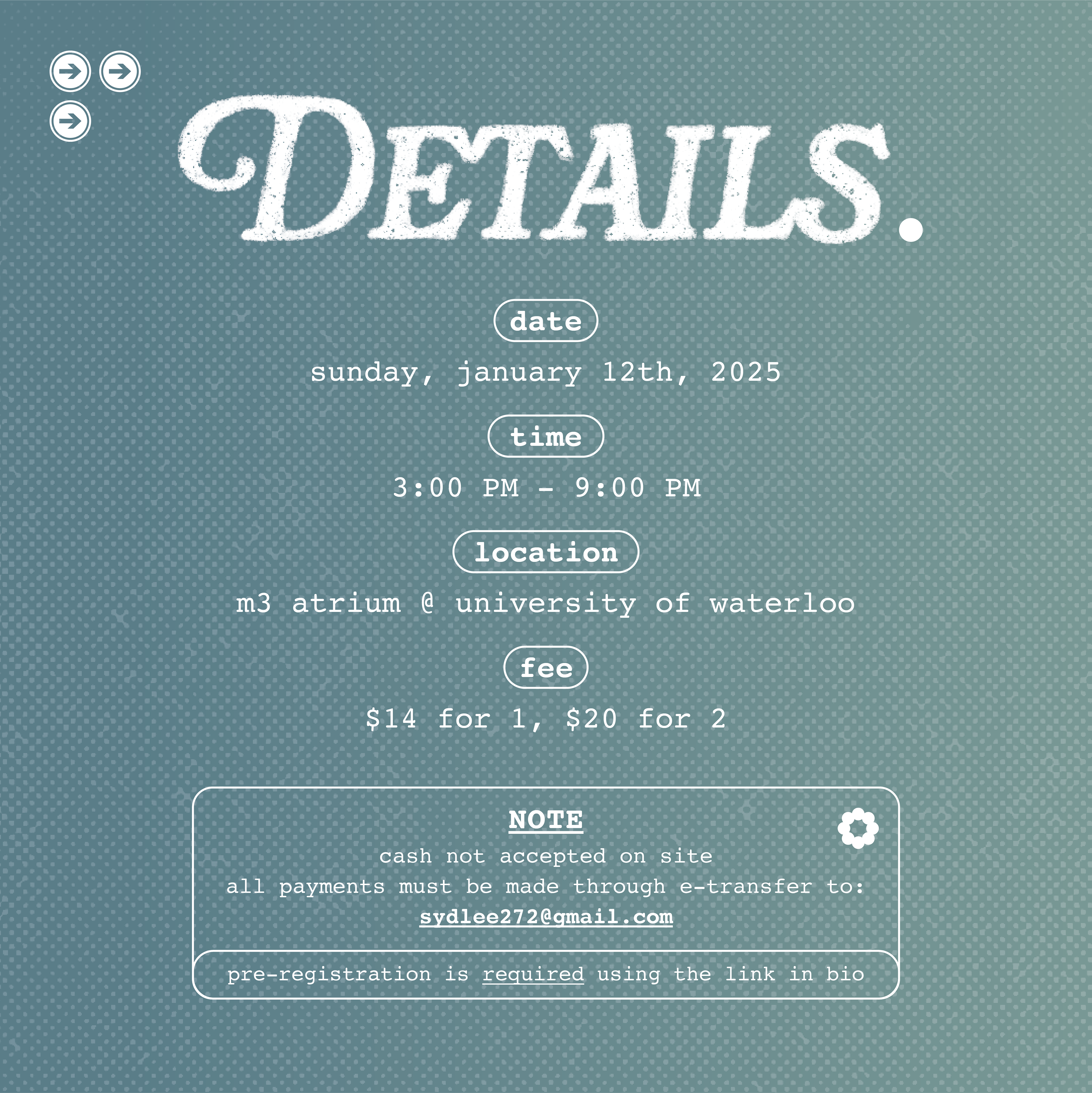
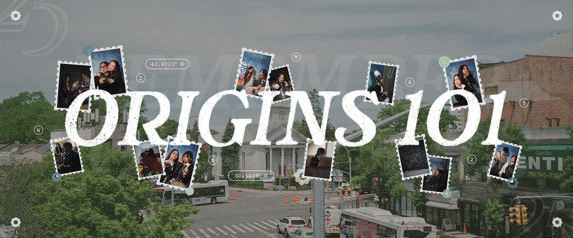
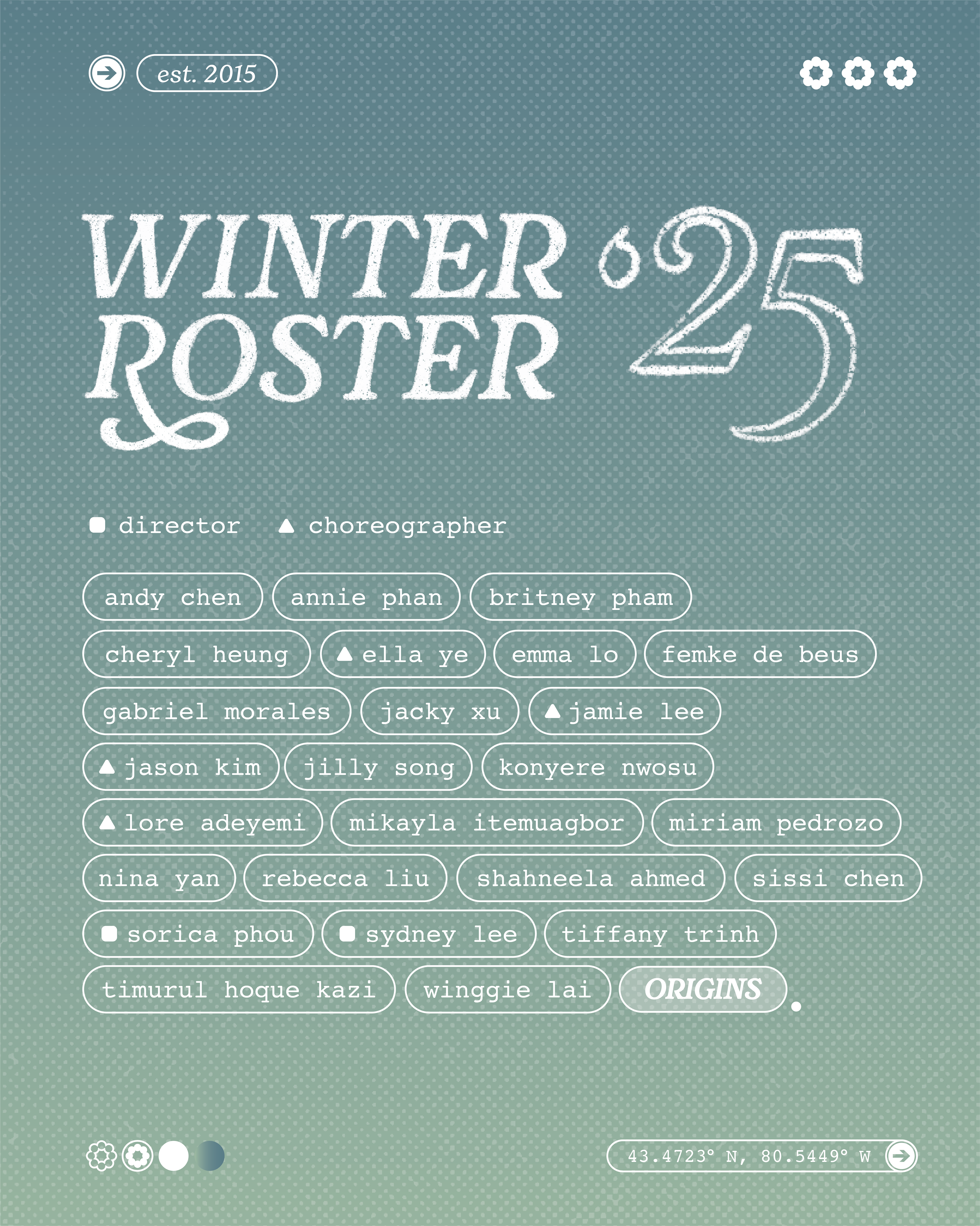
WINTER 2025

Fall 2024
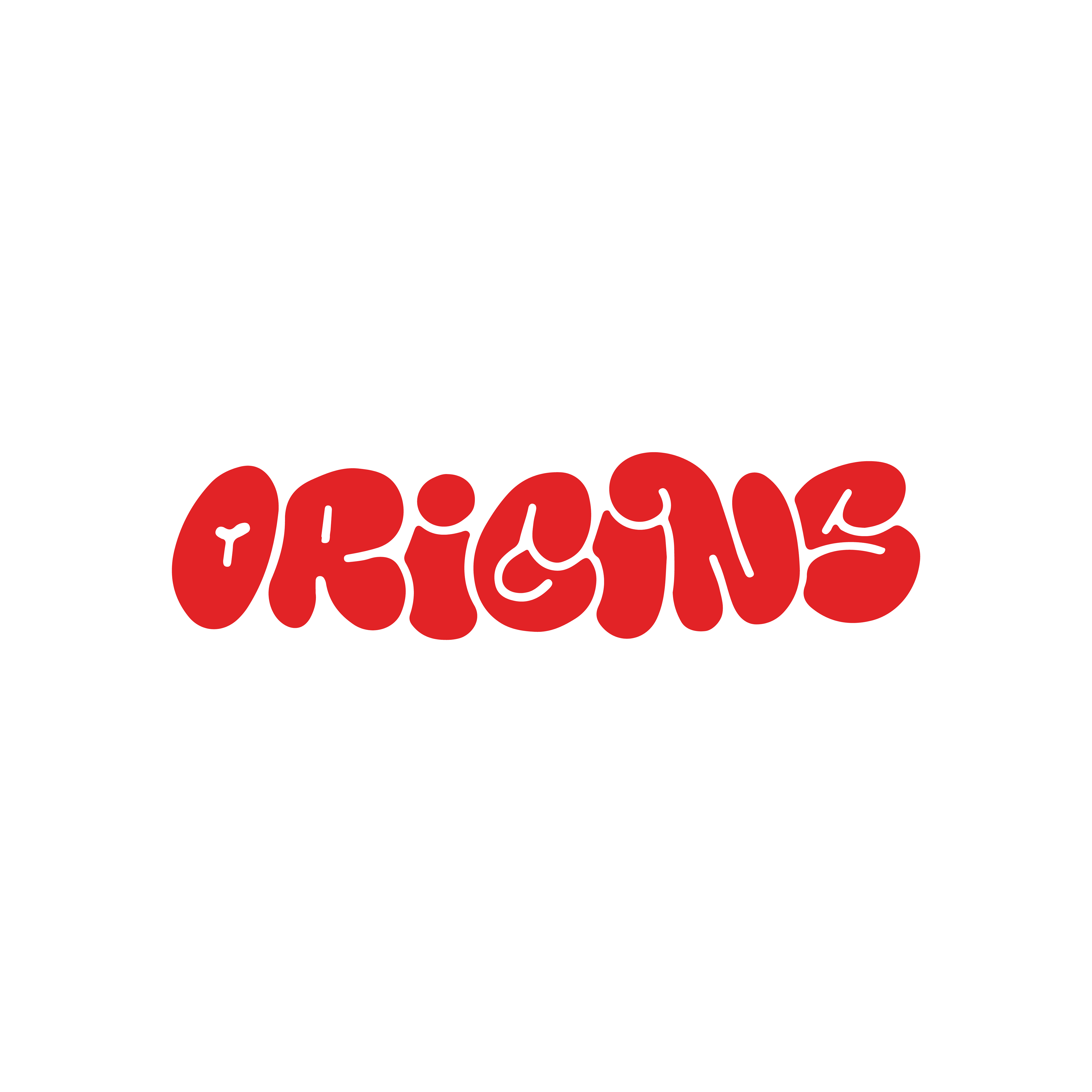

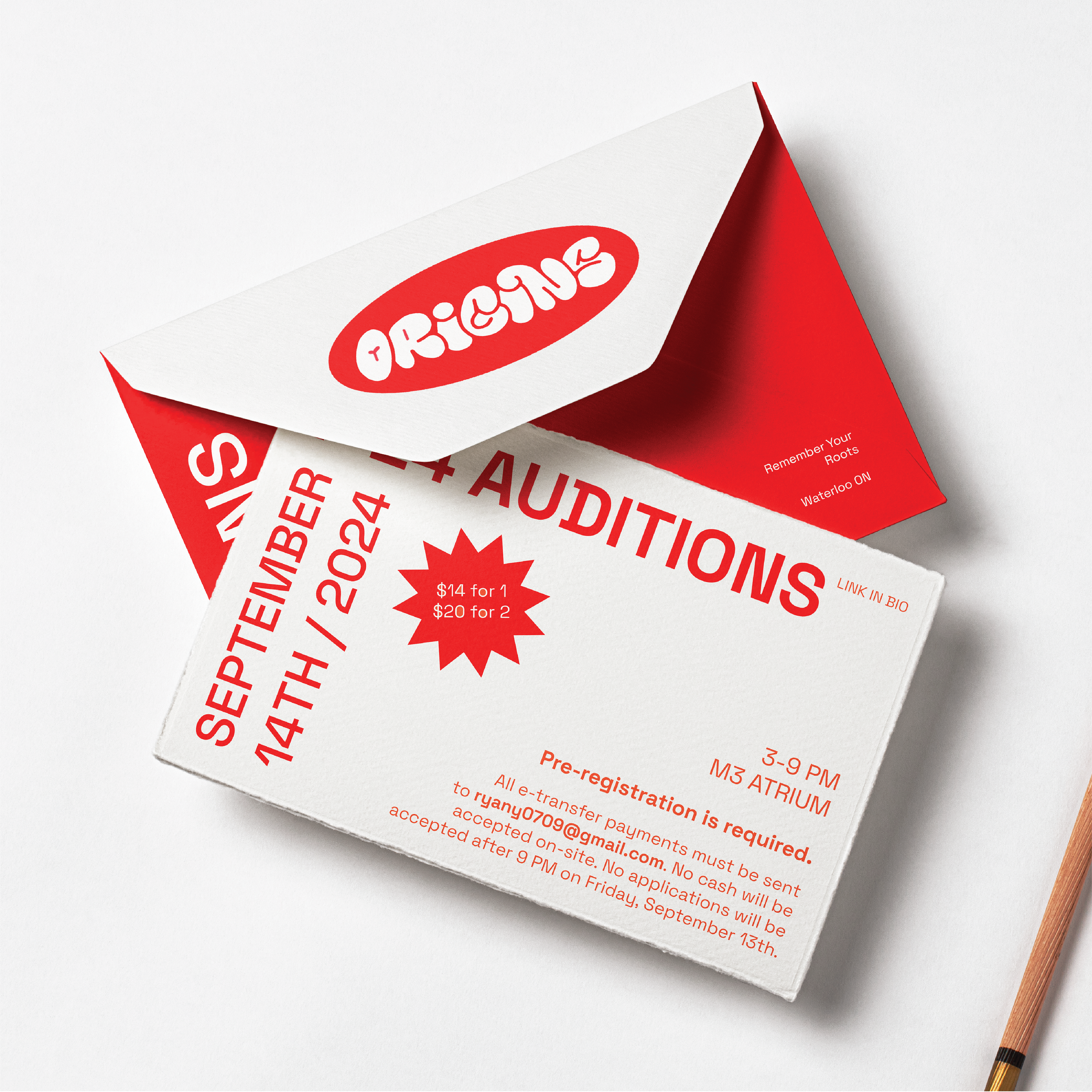

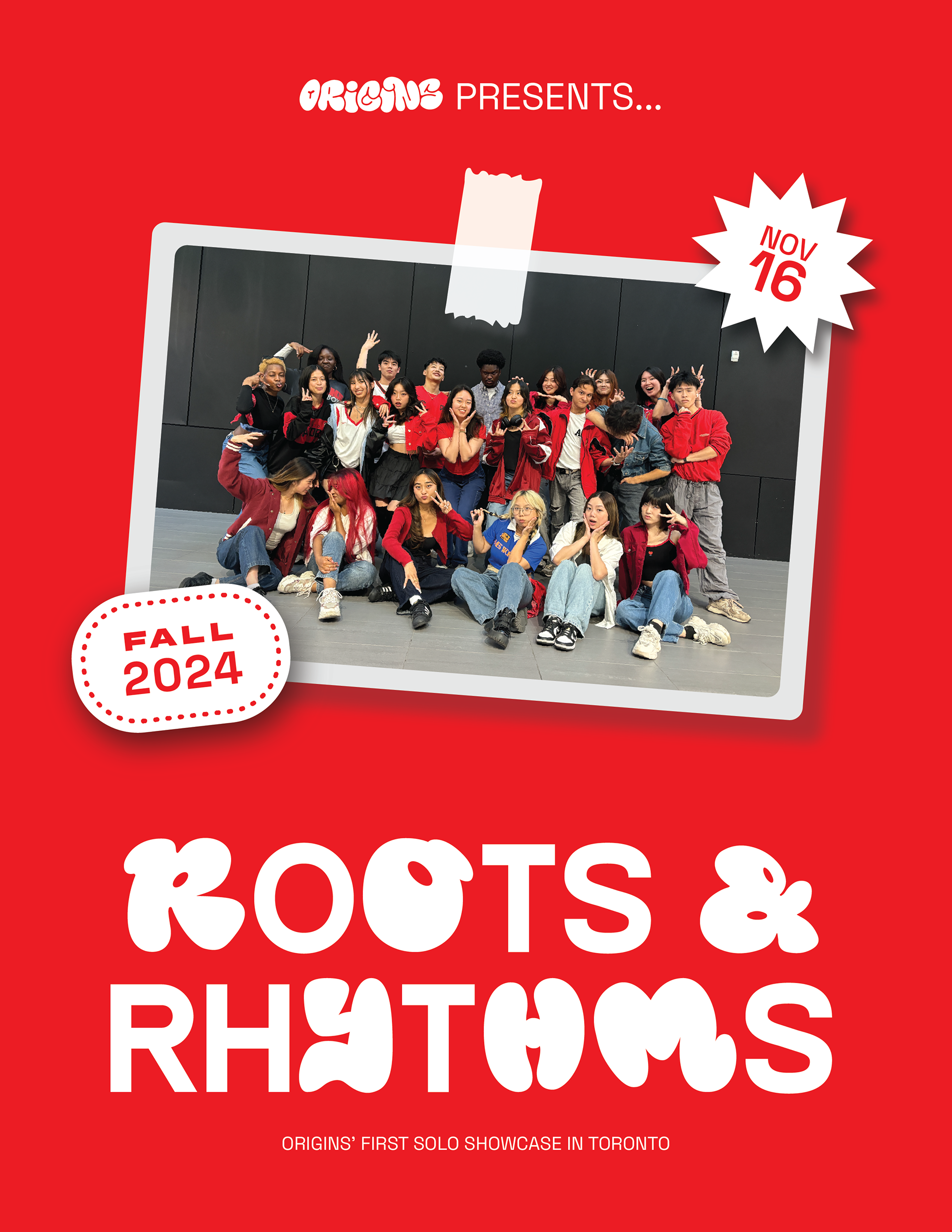
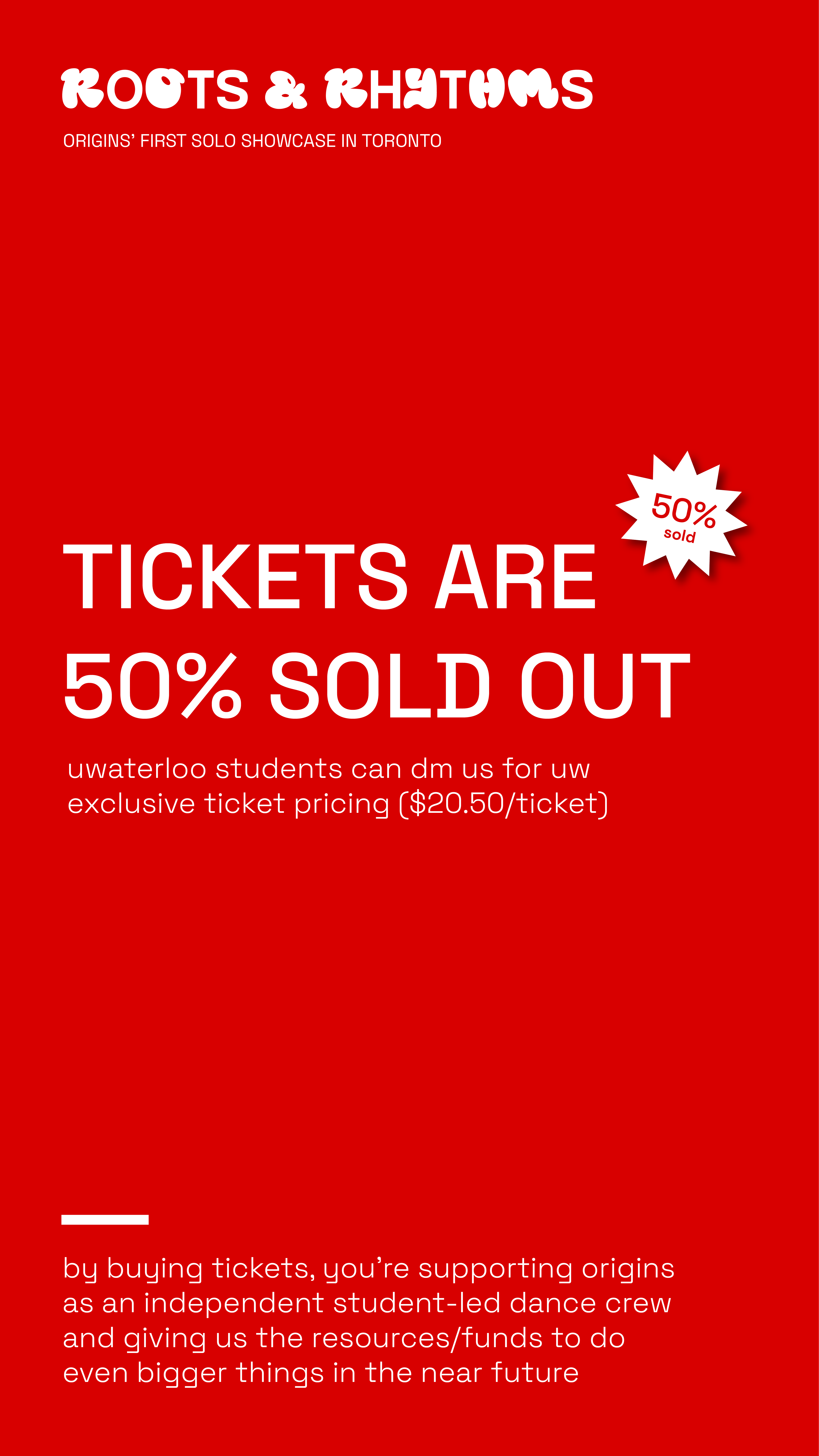
This term, the client wanted to introduce a sense of boldness and playfulness to the identity of Origins for Fall 2024. Throughout previous terms, the branding has always been more elegant and structured, thus they wanted something that would stand out. The focal point of this theme is the bright red colour and the bubble font. For the branding of their first ever showcase, "Roots & Rhythms", I maintained the playfulness with sticker/scrapbook elements and a font that mixed sans serif and display styles.
SUMMER 2024
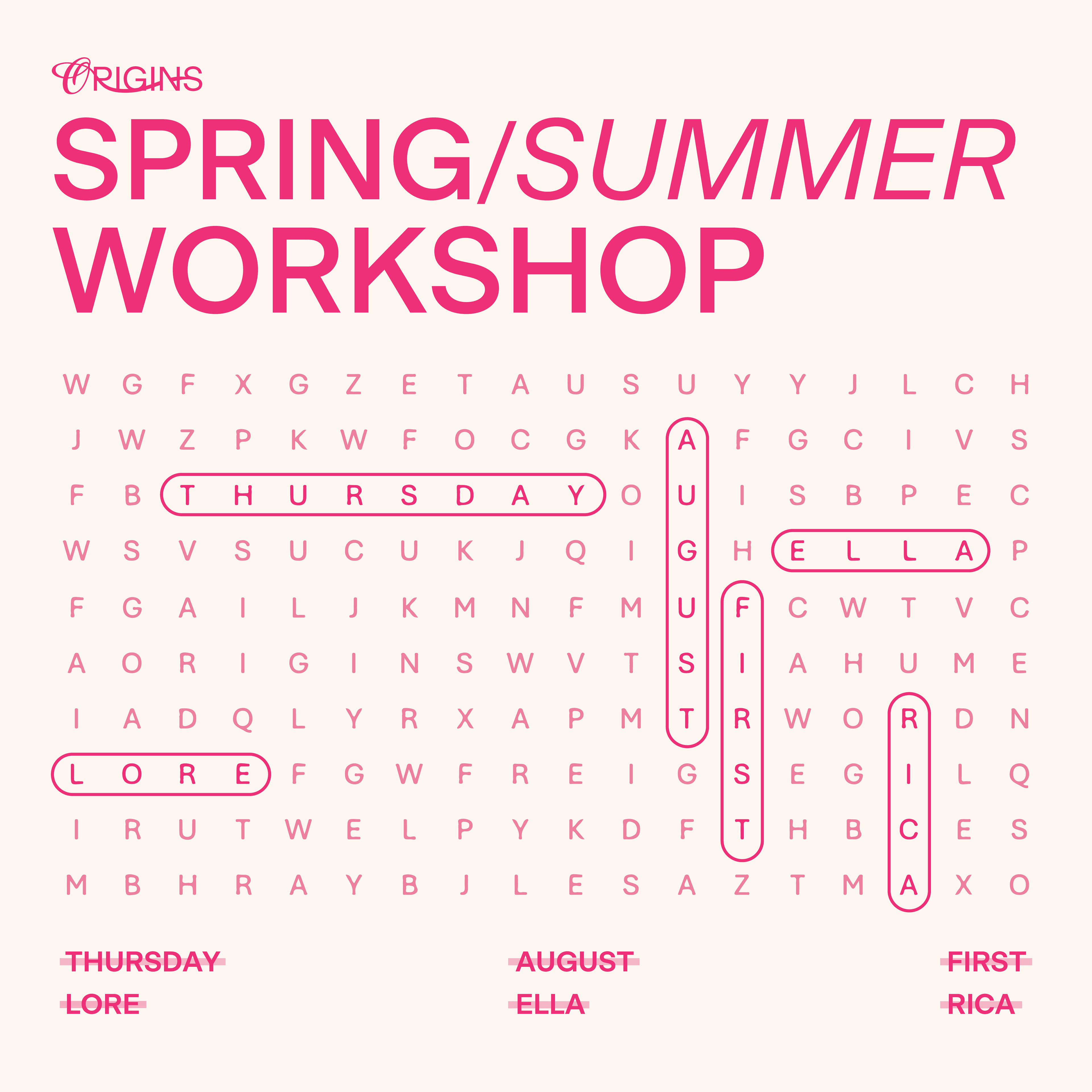
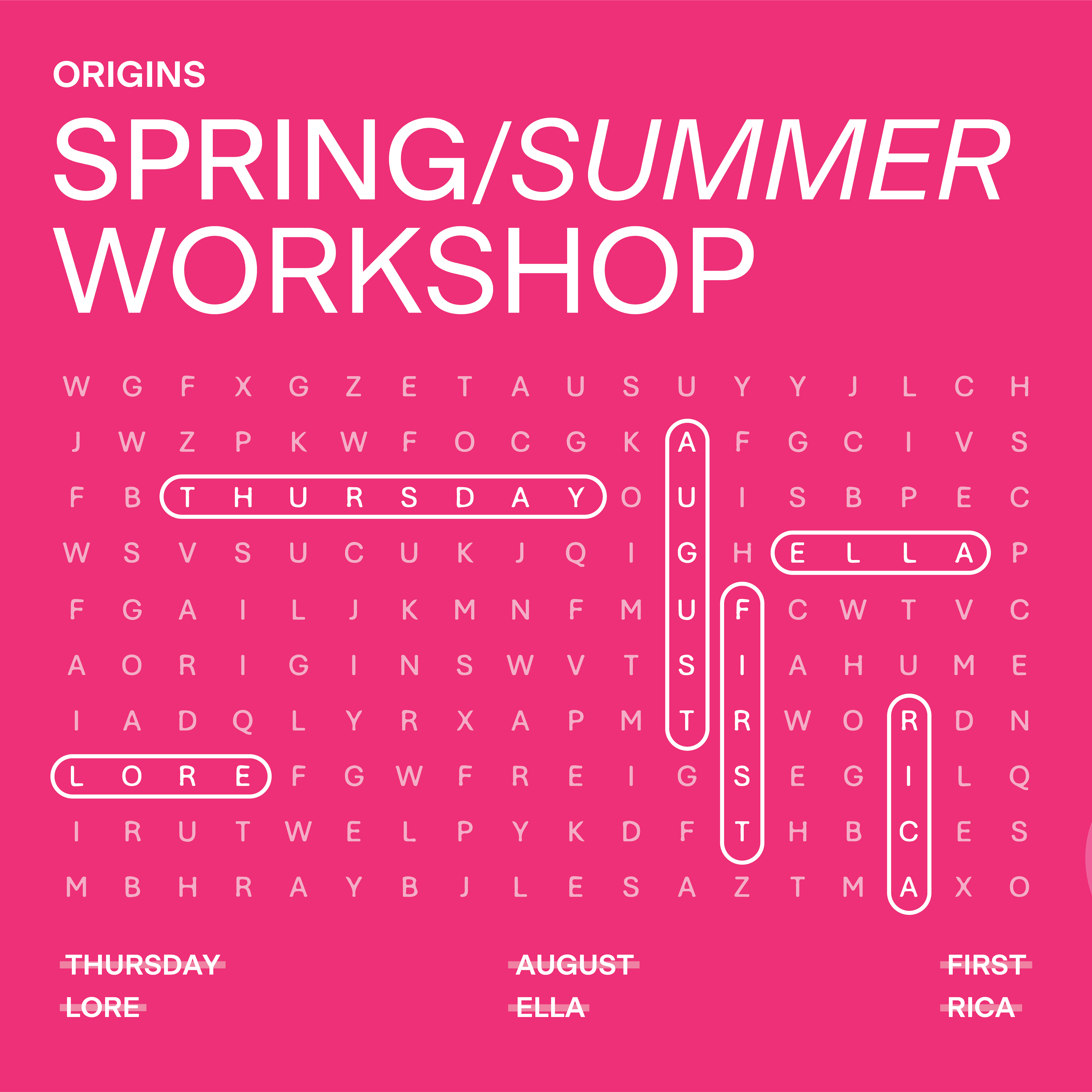

WINTER 2024
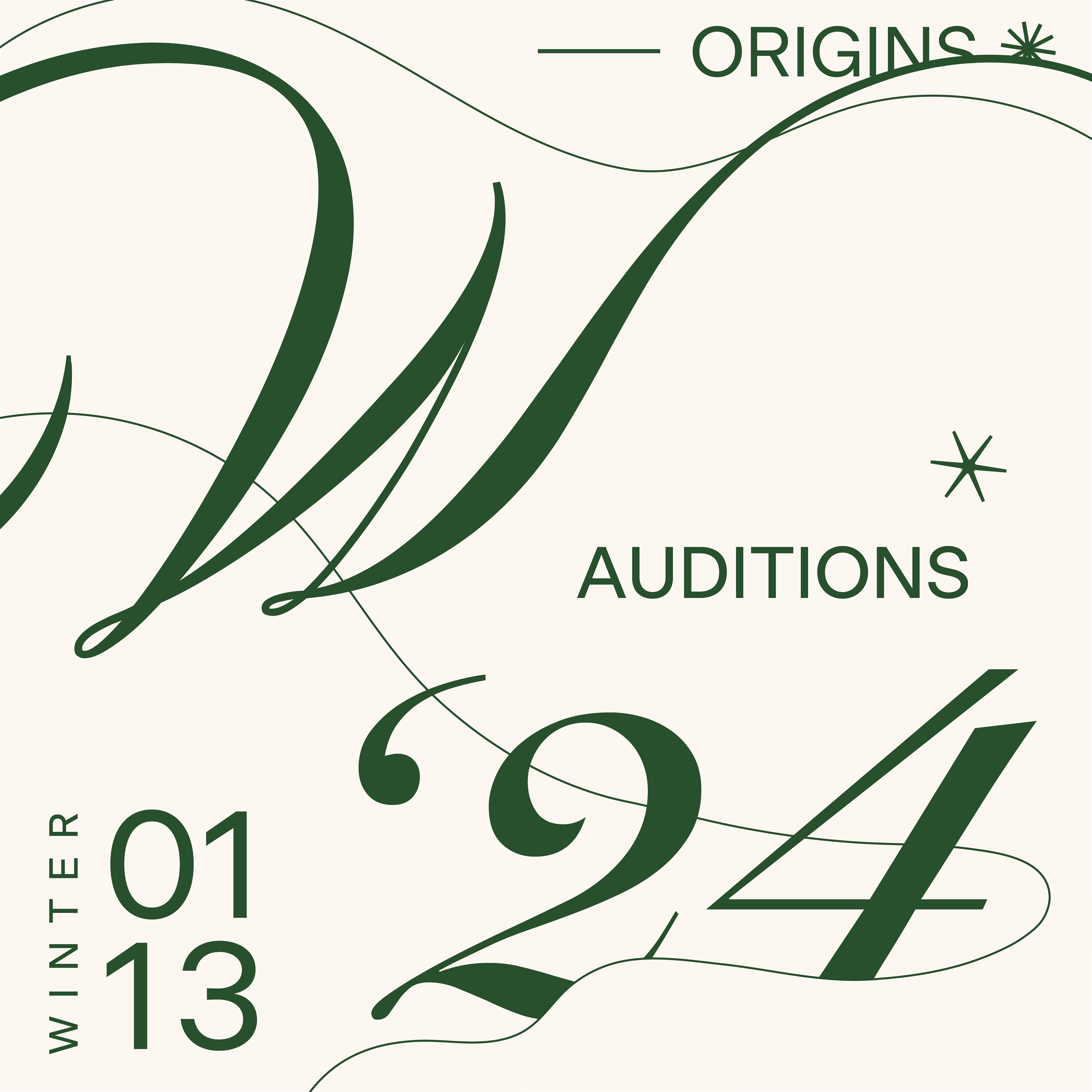



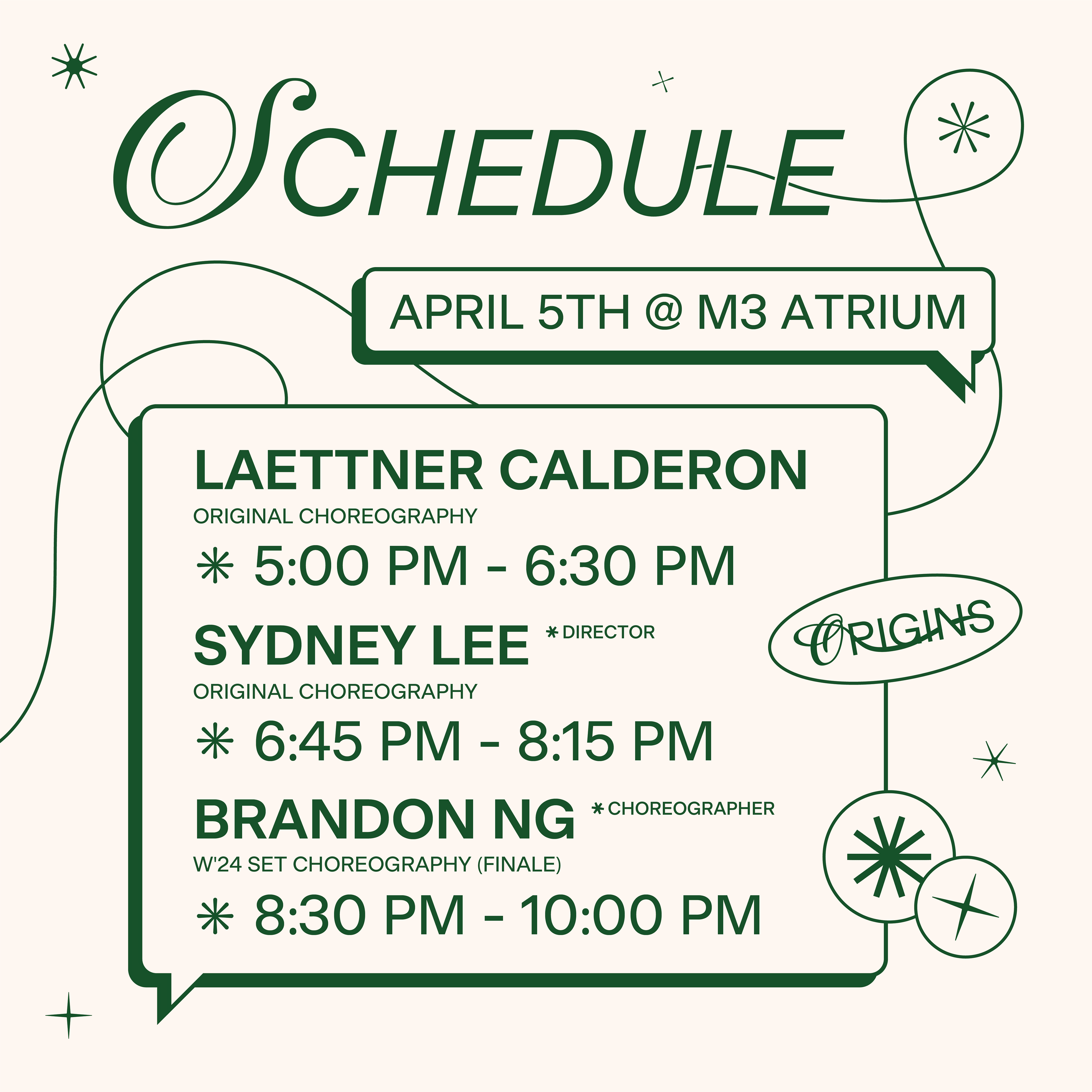
This term, we opted for a dark forest green theme, as the colour is closely associated with ORIGINS' history. Their motto is "remember your roots". They frequently use a sprout to represent themselves since it is a sign of growth and the roots of existence. The symbolism appropriately portrays the team's work ethic and character, and solidifies the brand's connection to nature; hence the decision for green to be the dominant colour for this term.
FALL 2023

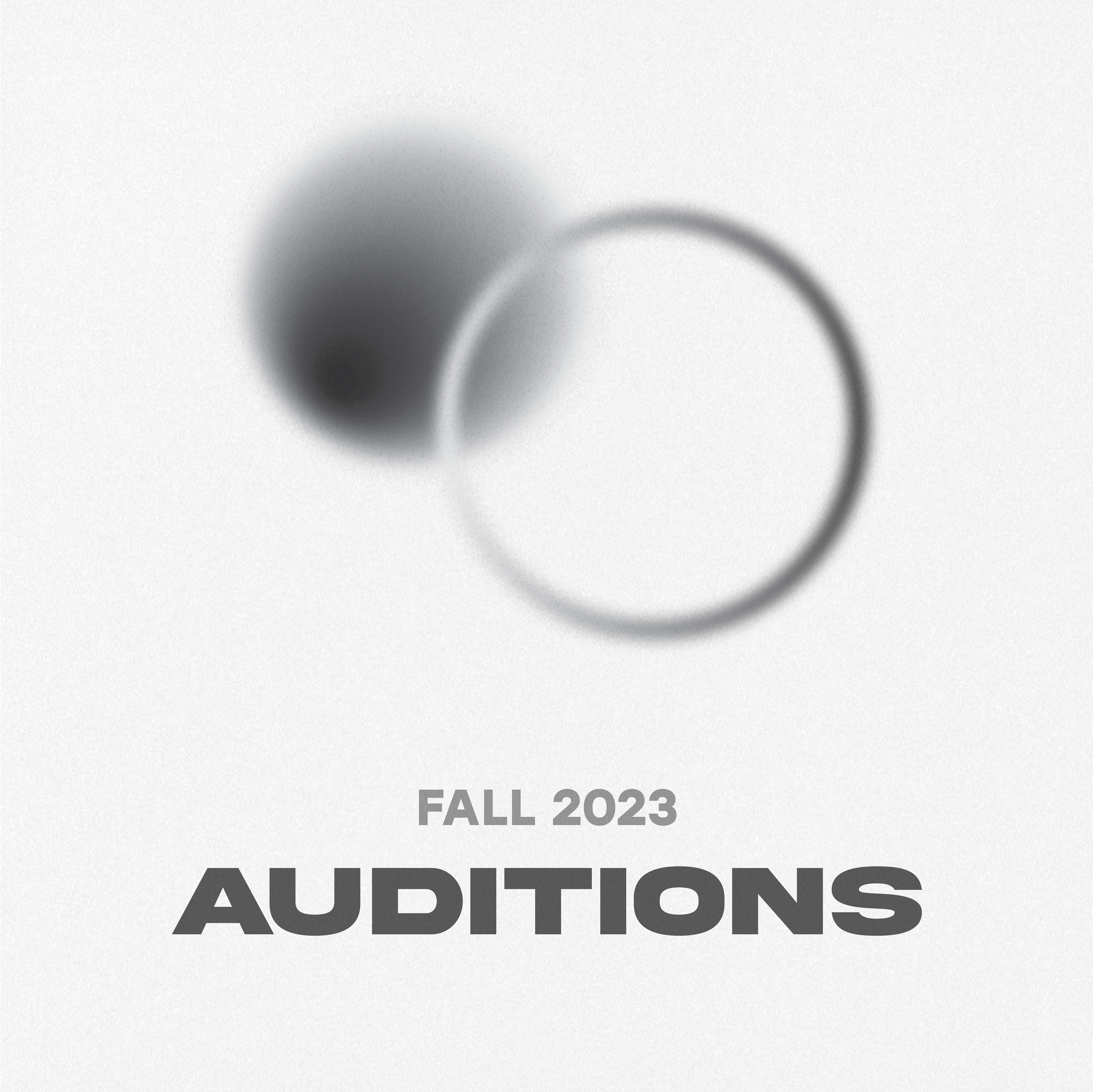
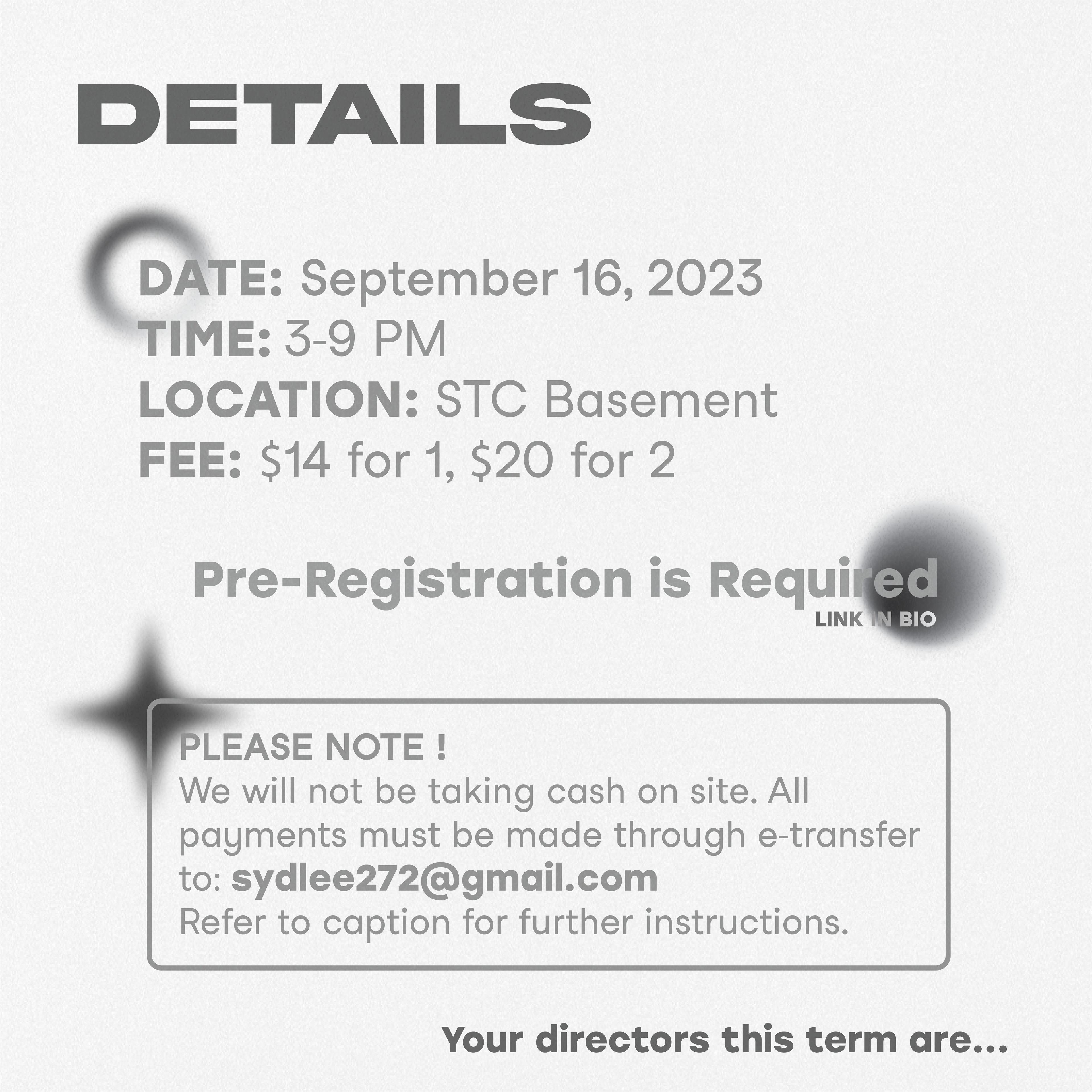
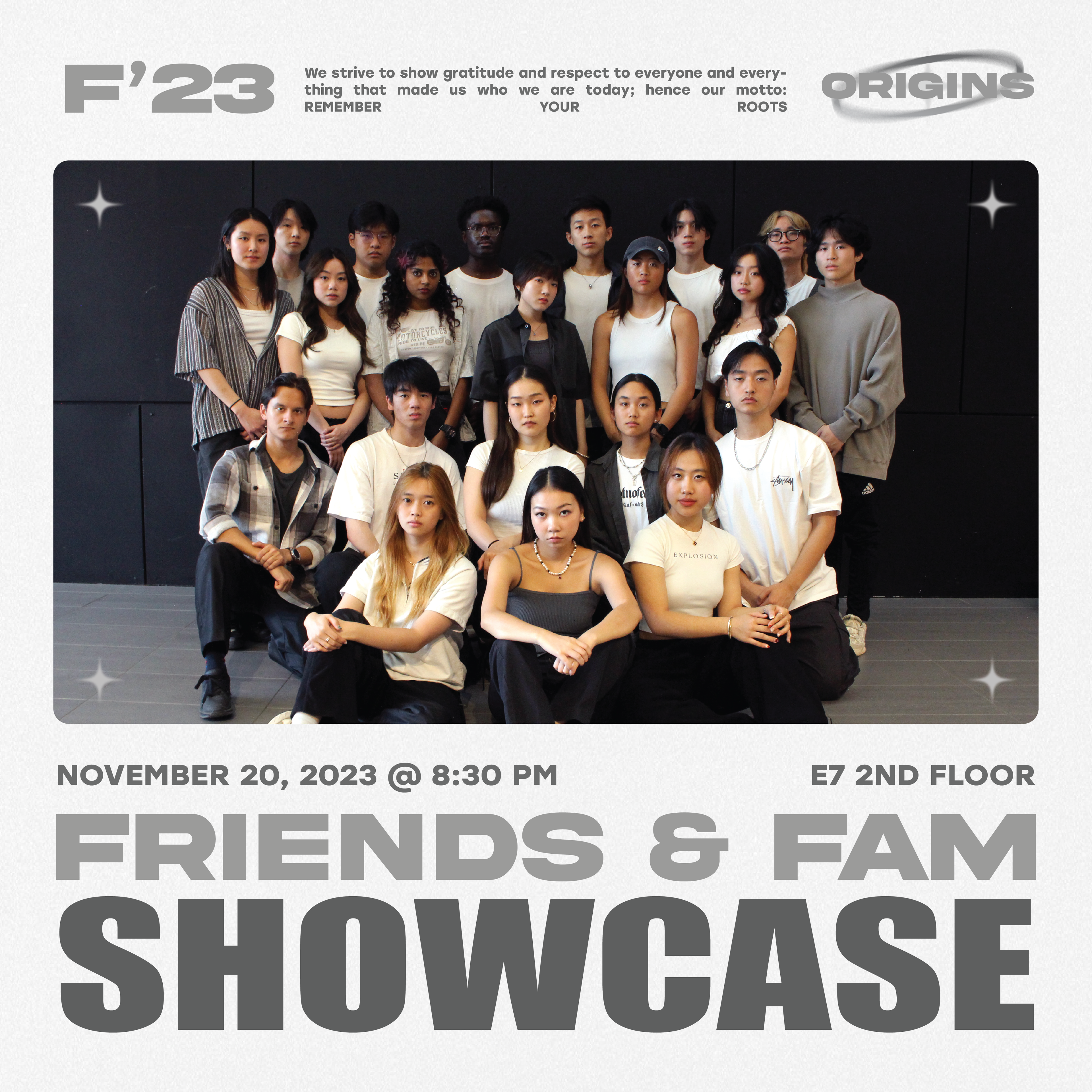

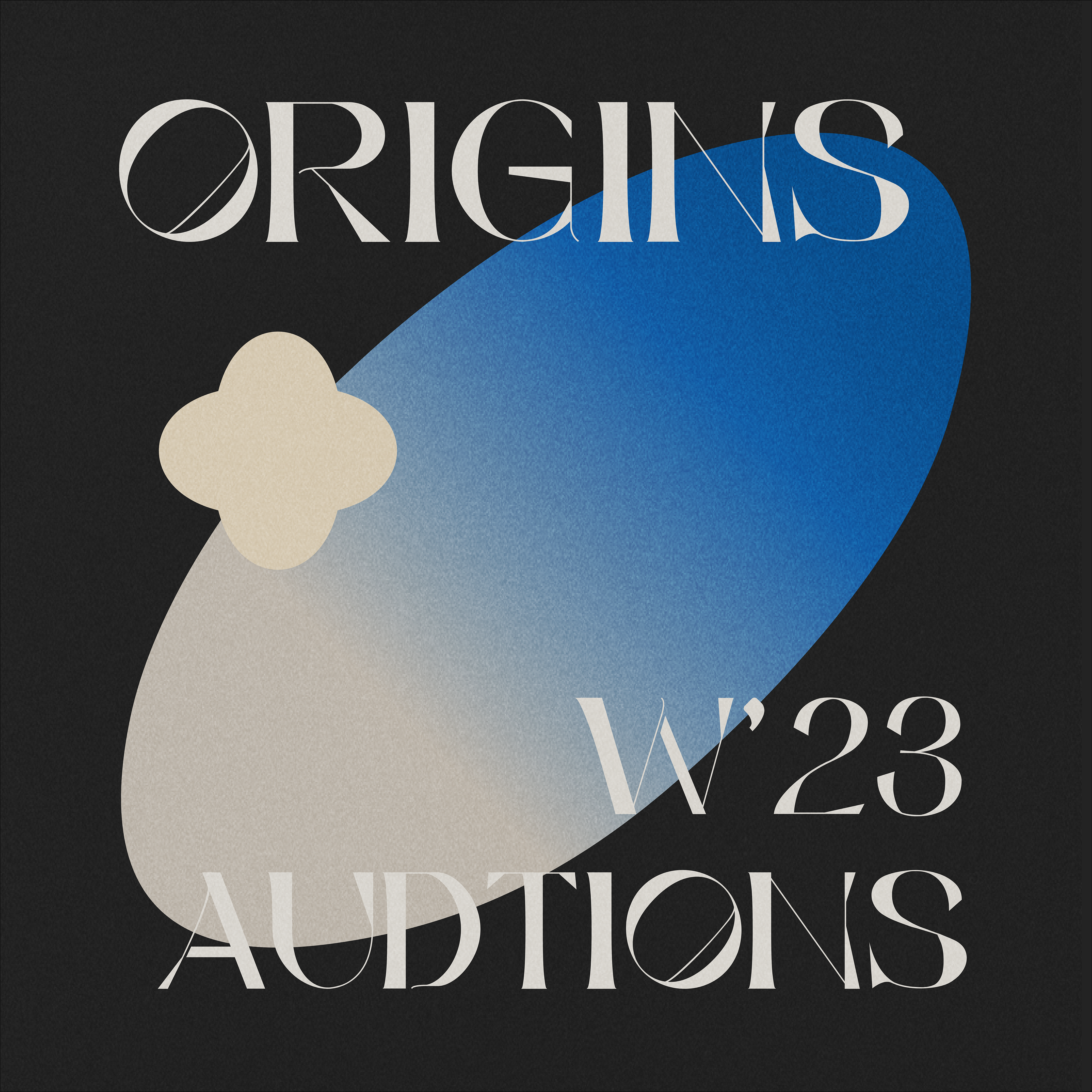
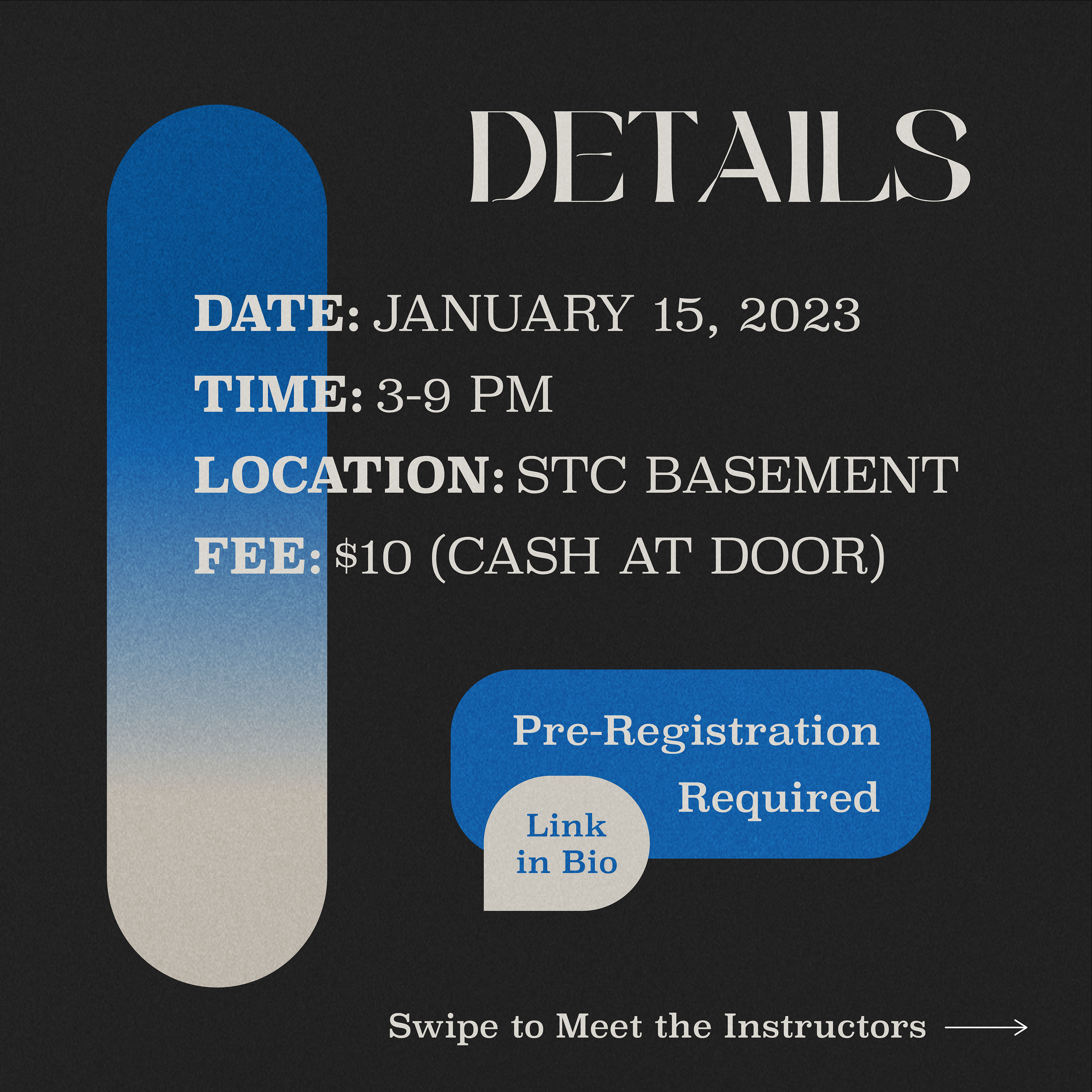
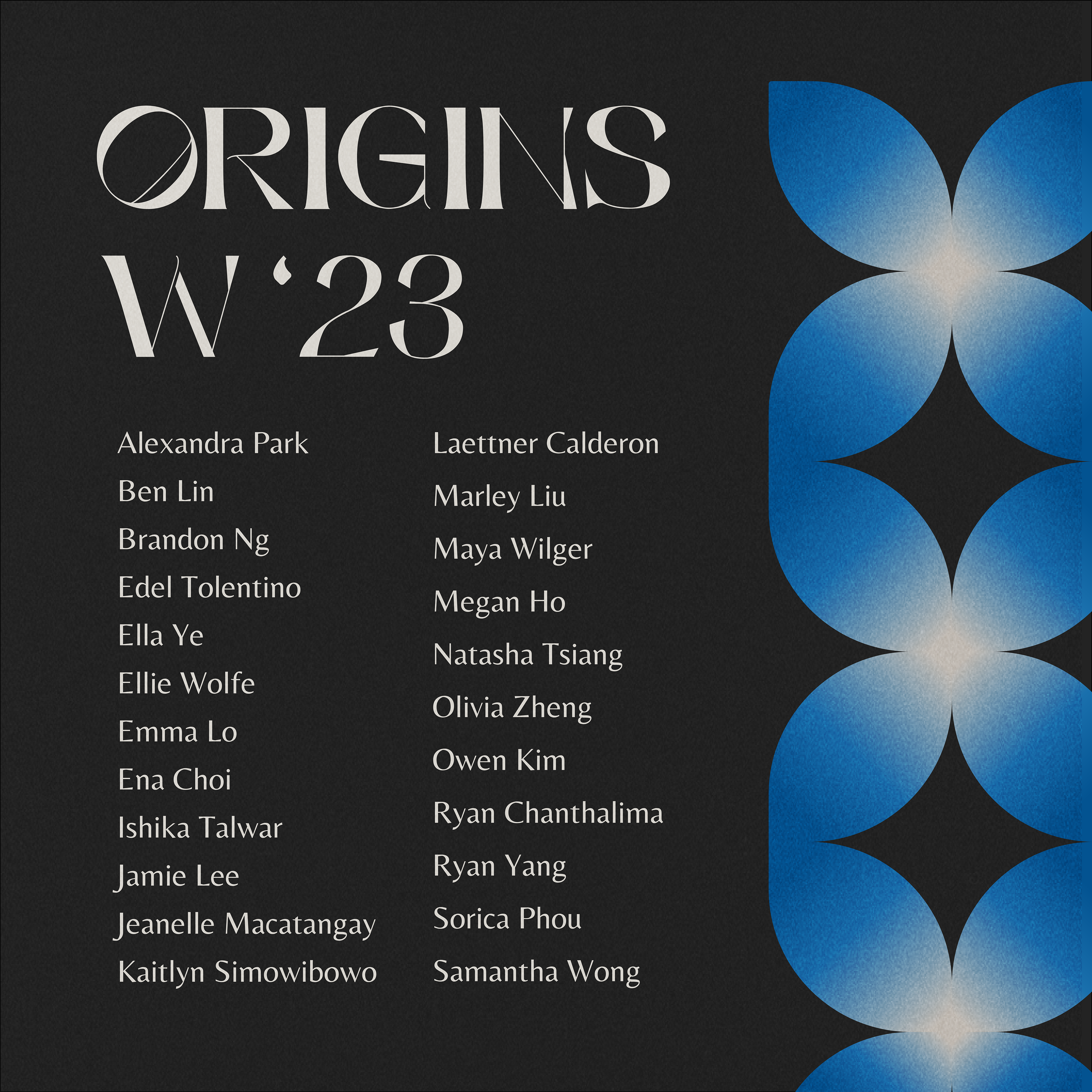
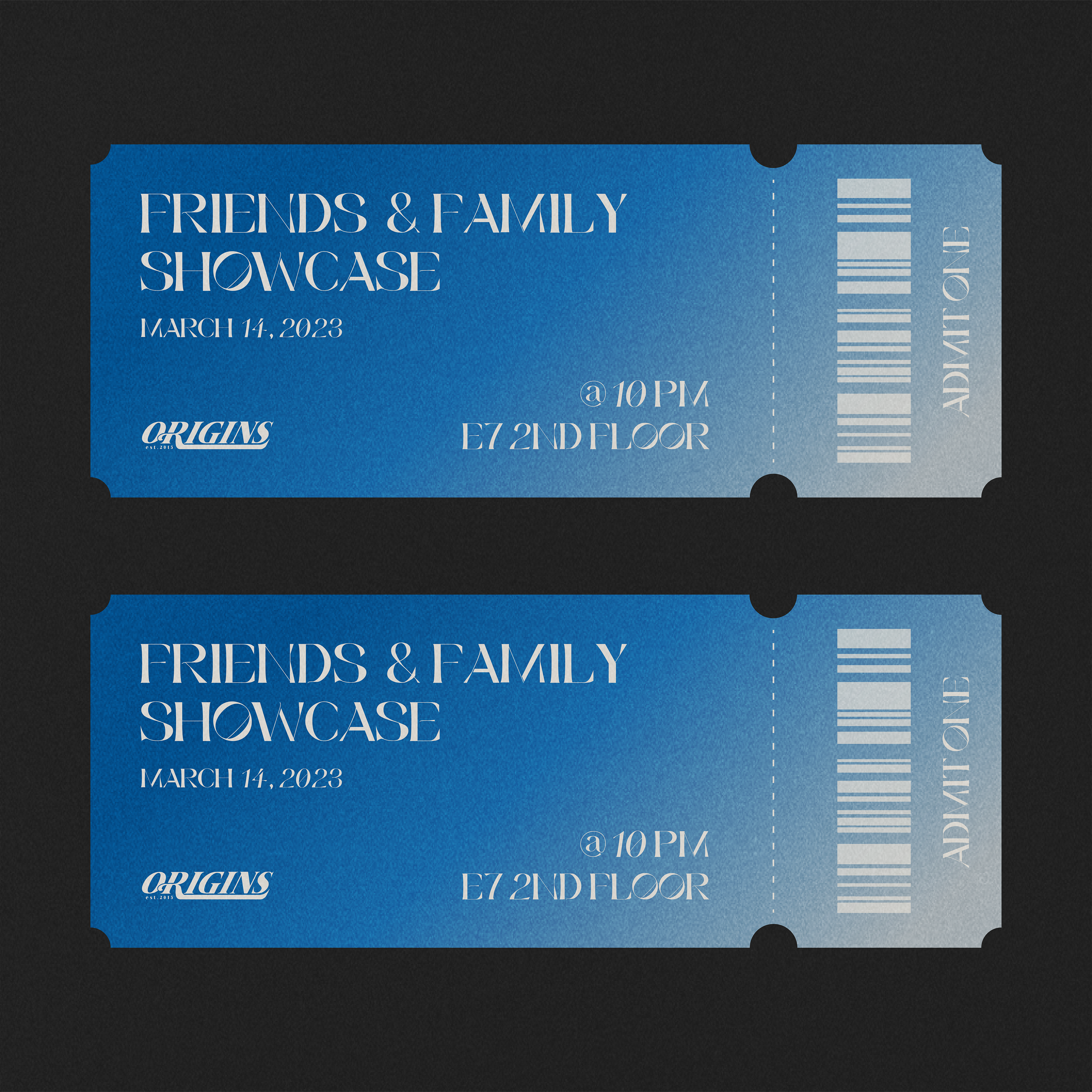
WINTER 2023